Civilization VII's Deluxe Edition launched just yesterday, and online discussions are already buzzing about its user interface (UI) and other perceived shortcomings. But is the UI truly as flawed as some claim? Let's delve into the game's UI elements and determine if the internet's assessment is accurate.
← Return to Sid Meier's Civilization VII main article
Is Civ 7's UI as Bad as They Say?
With the Deluxe and Founder's Editions now available, Civilization VII is facing criticism, particularly regarding its UI (and other missing quality-of-life features). While it's easy to join the chorus of complaints, let's objectively evaluate whether the UI truly deserves the harsh criticism. The best approach? A piece-by-piece analysis to see if it meets the standards of a good, or at least functional, 4X interface.
What Makes a Good 4X UI?
Defining an objectively "good" 4X UI is challenging. The ideal UI varies depending on the game's context, style, and goals. However, visual design principles reveal common elements found in successful 4X UIs. Let's use these established principles to evaluate Civ VII's UI.
Clear Information Hierarchy
A clear information hierarchy prioritizes accessibility and importance. Frequently used resources and mechanics should be prominent, while less critical features should be easily accessible with minimal clicks. A good UI doesn't display everything at once, but organizes information logically.
Against the Storm offers a strong example. Building info menus, accessed via right-click, are divided into tabs, prioritizing common actions (worker assignment, production) in the default tab, while less frequent functions are in subsequent tabs.
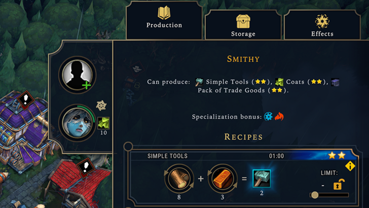
Let's examine Civilization VII's resource summary UI. It displays resource allocation, separating income, yields, and expenses via dropdowns. The table format is efficient, and the menu collapses easily. However, it lacks granular detail. While overall resource totals from rural districts are shown, specific district or hex contributions aren't detailed. Expense breakdowns are also limited.
In short, Civ VII's resource UI is functional but could benefit from increased specificity.
Effective and Efficient Visual Indicators
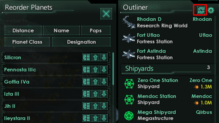
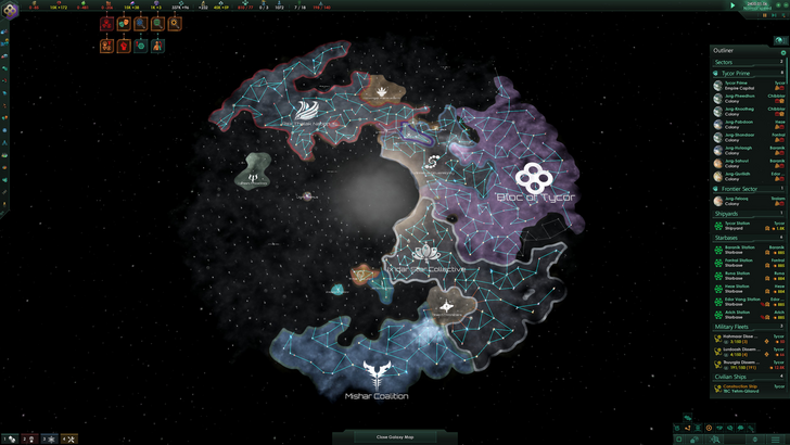
Effective visual indicators use icons and graphics to convey information quickly, reducing reliance on text. Stellaris, despite its cluttered UI, uses visual indicators effectively in its Outliner, clearly showing ship status at a glance.
Civ VII relies on iconography and numerical data, but includes some effective visual elements: the tile yield overlay, settlement overlay (color-coded hex viability), and settlement expansion screen (distinguishing tile types).
The main criticism revolves around missing lenses from Civ VI (appeal, tourism, loyalty). The absence of customizable map pins is also noted. While not terrible, Civ VII's visual indicators could be improved.
Searching, Filtering, and Sorting Options
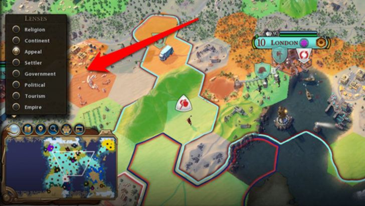
In complex 4X games, search, filter, and sort functions are crucial for managing information overload. Civ VI's powerful search function, allowing map-wide searches for resources, units, etc., is a prime example.
Civ VII notably lacks this crucial search function, a significant usability drawback. The absence is a major criticism, impacting gameplay significantly. Adding this feature, along with enhanced Civilopedia functionality, is essential.
Design and Visual Consistency
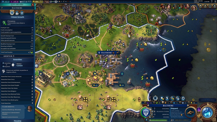
UI design and visual consistency are paramount. Civ VI's dynamic, cartographical style seamlessly integrates with its aesthetic, creating a cohesive experience.
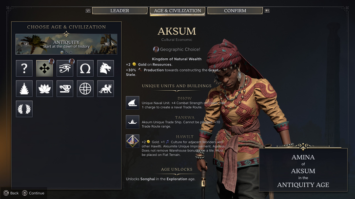
Civ VII adopts a minimalist, sleek design, prioritizing sophistication over vibrant visuals. The restrained color palette aligns with the game's aesthetic, but its subtlety may lack immediate appeal for some players. This is subjective, but the less visually striking approach contributes to mixed reactions.
So What’s the Verdict?
Not the Best, But Undeserving of Extreme Criticism
Civ VII's UI, while not ideal, doesn't deserve the extreme criticism it's received. The missing search function is a significant flaw, but not game-breaking. Compared to other issues, UI shortcomings seem minor. While it pales compared to some more visually striking 4X UIs, it possesses strengths. With updates and player feedback, it can improve significantly. Currently, it's not as bad as many claim.
← Return to Sid Meier's Civilization VII main article
Sid Meier's Civilization VII Similar Games